Christian Lawson-Perfect
- e-learning officer, School of Mathematics and Statistics, Newcastle University
- Born and raised in Newcastle
- Recently double-barrelled
- Lead developer of Numbas
The landscape
- Islands of use
-
Commercial systems bundled with textbooks
- Or systems developed by the only person using them
- Or without support from higher-ups
This talk is about how to do
e-assessment well
We need to share what we're doing — and make a song and dance about successes
Good news from Newcastle
Numbas was used in 48 modules in the 2015/16 academic year
by 2,000 students, who completed a total of 40,800 attempts.
Core team of 3 developers, with lecturers writing some material.
Maths has special needs
- Just displaying maths is hard
- Randomly generating maths questions is harder
- Marking maths questions is hardest of all
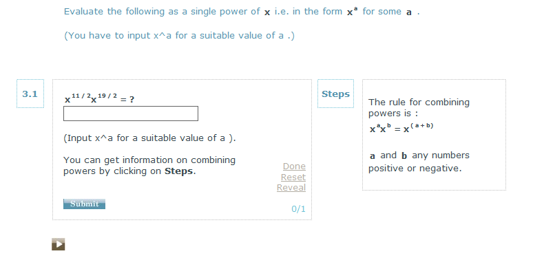
UX
User experience is really important.
An e-assessment system should be clear and intuitive.
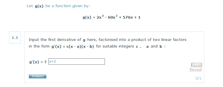
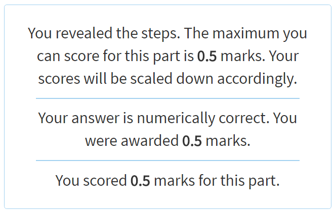
Marking must do what it says, and say what it does
im a massive pedant
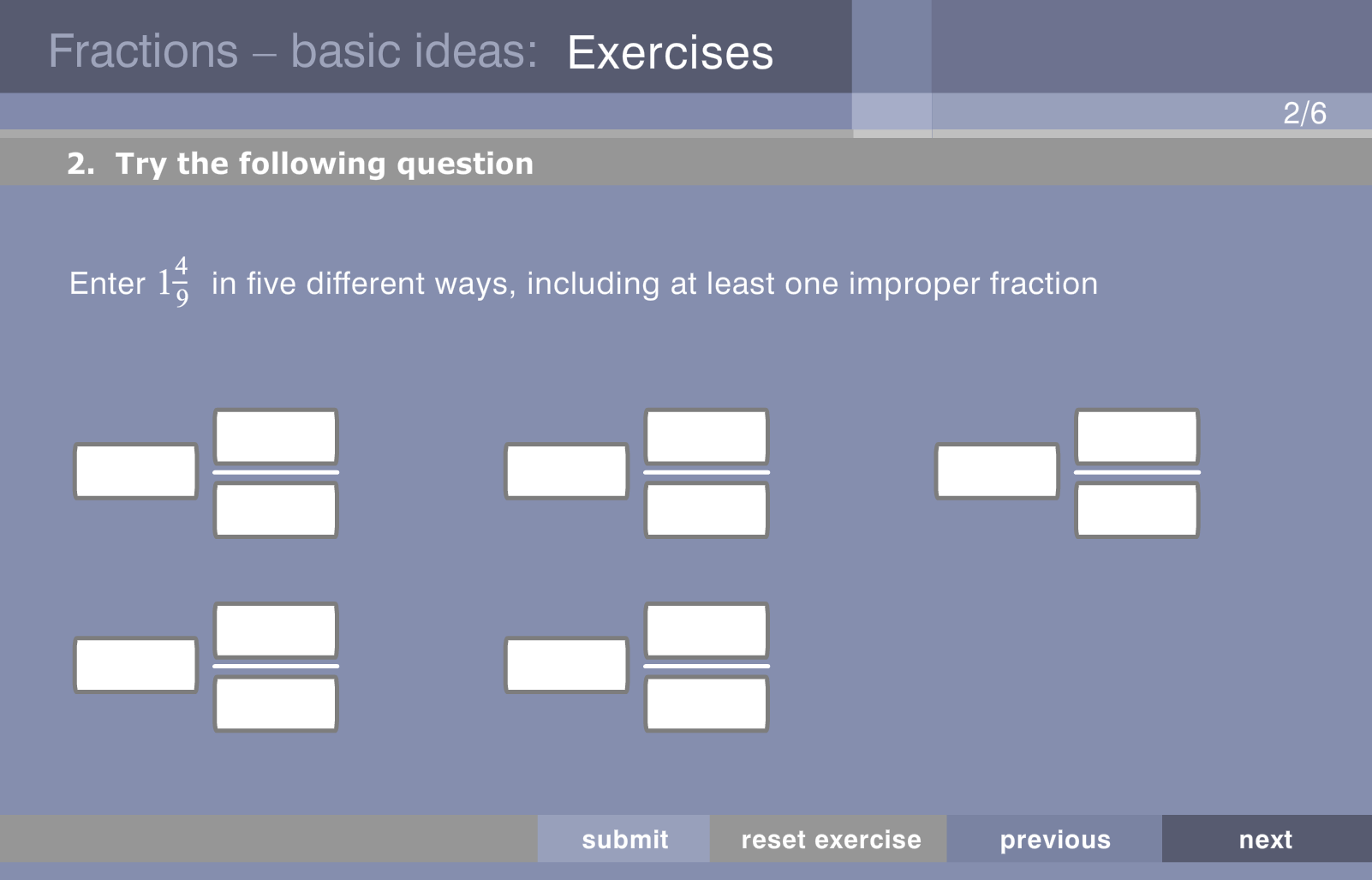
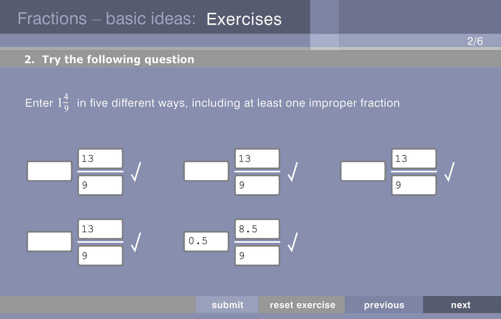
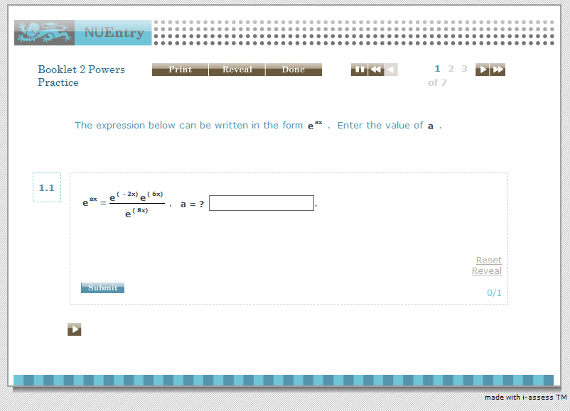
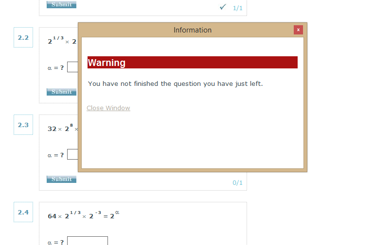
Little details in i-assess


This applies to
question design too
Good questions:
- Tell the student what you want them to do.
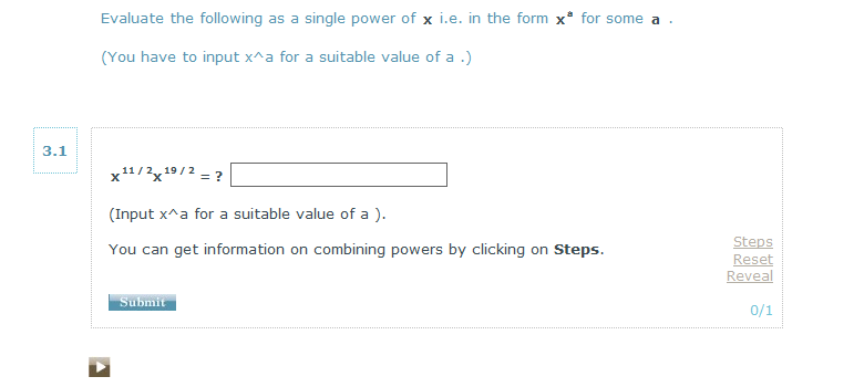
- Tell them how to enter their answer, including any restrictions.
- Put things in the right order and make important information easy to find again.
- Make sure graphics are readable.
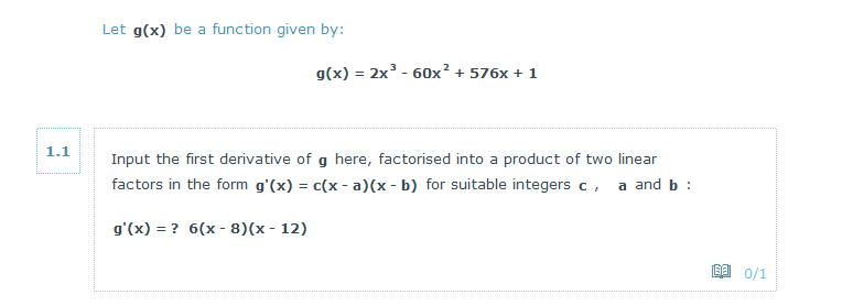
- Explain how the mark was calculated.
- Are written in full sentences.
The VLE
You typically have much less control over the larger environment your e-assessment runs in.
BUT
Student should be able to:
- See their score or status
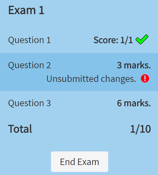
- Review their session
The authoring experience is also important
- I prefer WYSIWYG to coding
- There should be a low barrier to entry
- The interface should link things together - "where is this variable defined?"
- Organising material is hard!
My favourite Numbas editor features
- Variable preview
- “How often is this condition met?”
- “Used by” and “Depends on” lists
- Instant LaTeX preview on top of WYSIWYG editor
Here at Newcastle
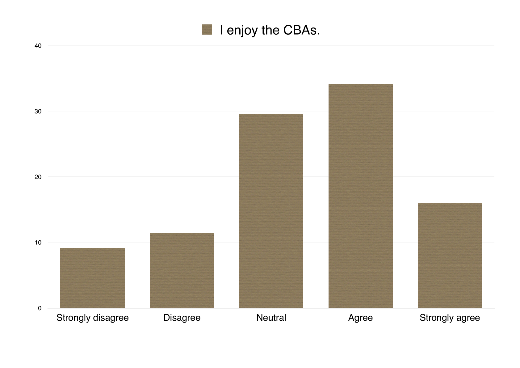
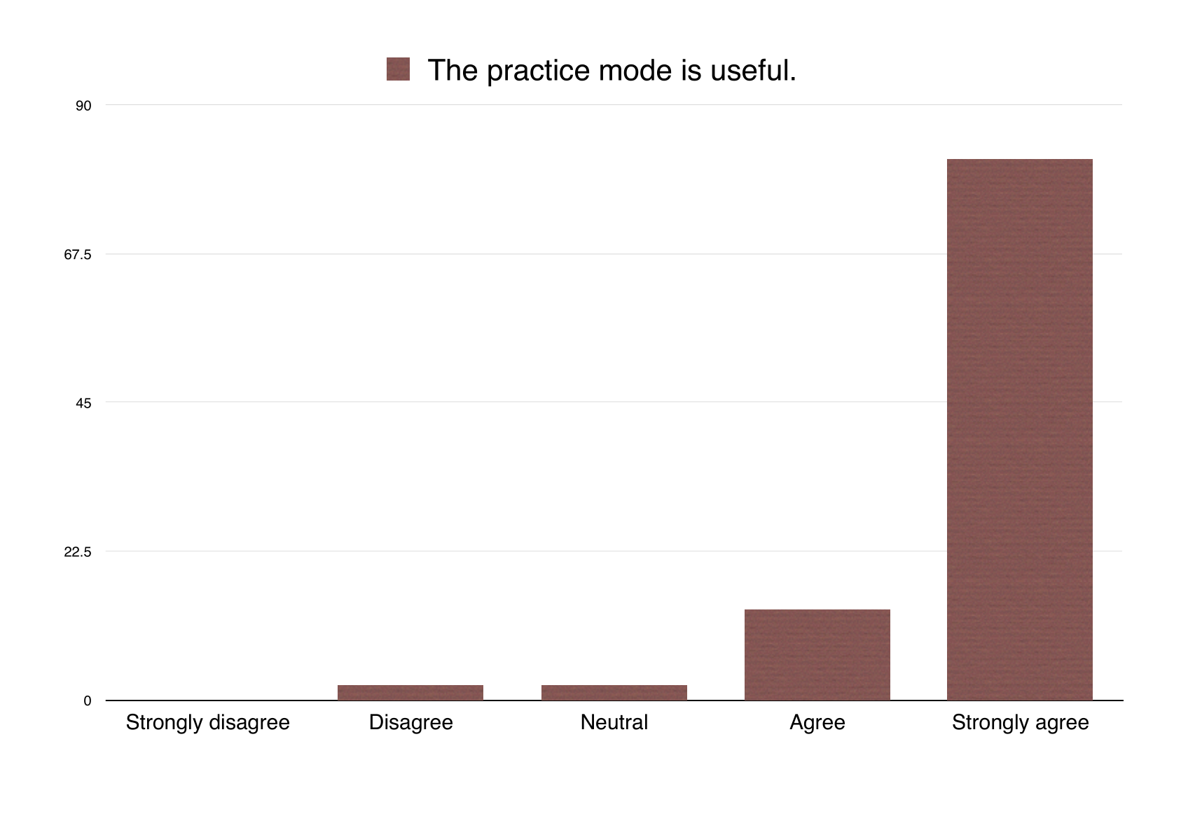
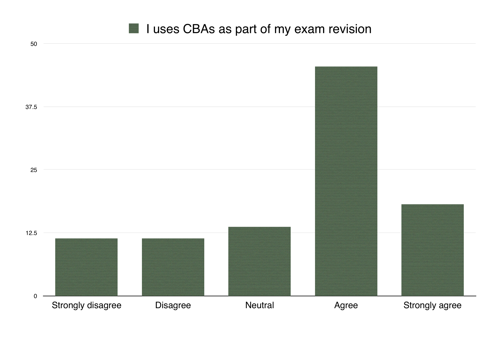
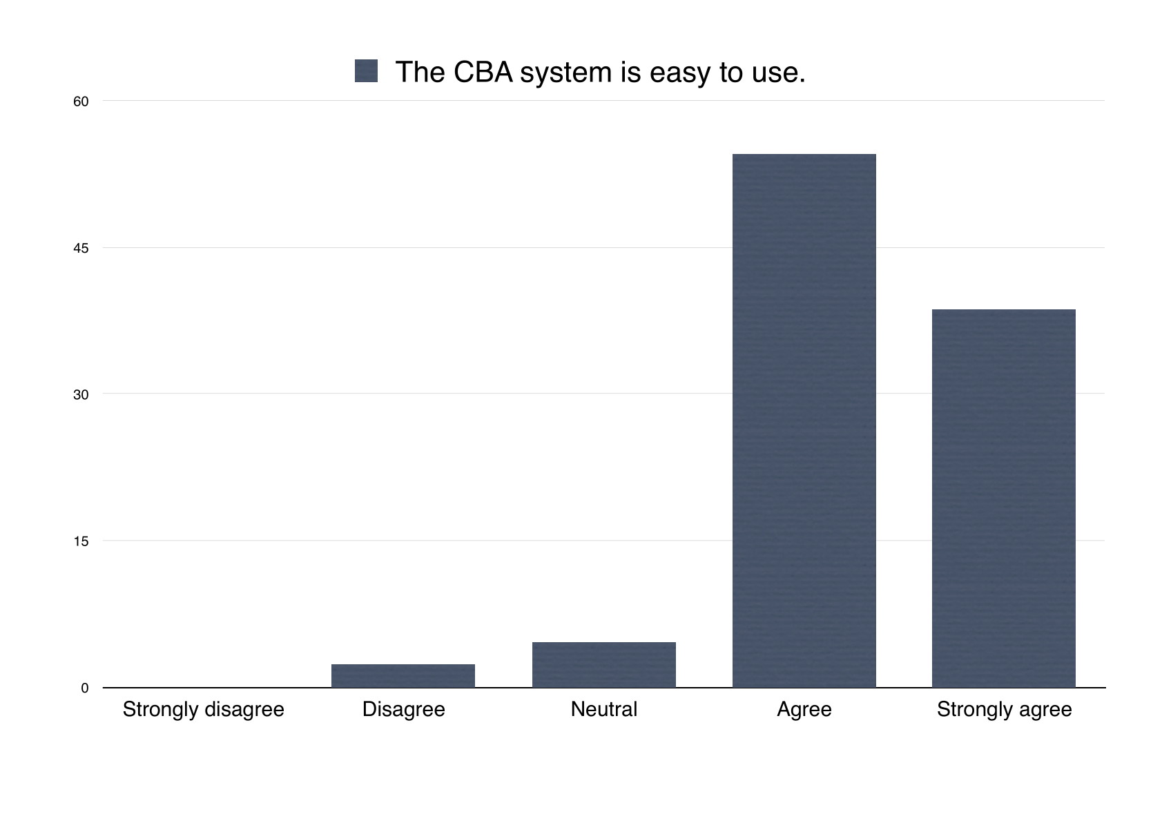
We improved student opinion and use of e-assessment
By...
- Improving the user experience of our system.
- Changing the way we make assessment available.
In 2006, we introduced CBAs to practise key skills in Stage 1.
Students saw a test for one week in practice mode, then get one attempt the following week in assessed mode.
As it was a success, use edged up the syllabus to stages 2 and 3.
In our new curriculum, students have access to a large bank of practice questions throughout the year.
Assessed tests are picked from the practice bank, so students should try everything.
Usage of practice material increased, particularly before exams.
Formative assessment
I'm not interested in summative assessment.
Because of the way e-assessment works, it's good for formative use.
Now
- Practice tests all over the place during courses
- A la carte tests through maths support service.
When marks don't matter, you can do more interesting things.
It's not just a question to finish any more.
A question is no longer a straight line, leading to a score and feedback.
Instead retry, and play with the system.
A question which begins by asking the student for some numbers
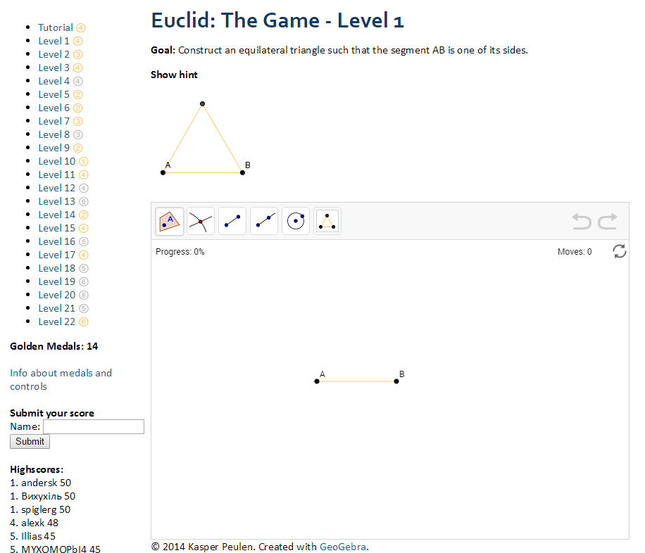
It's a short step from what we're doing to games
Primary school maths e-assessment is interesting.

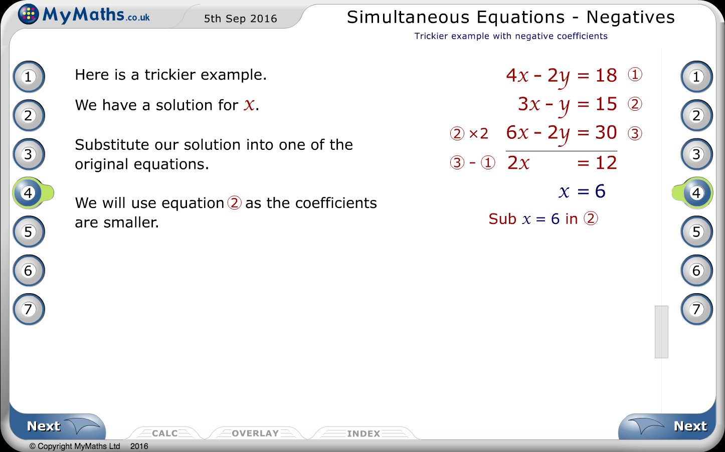
MyMaths

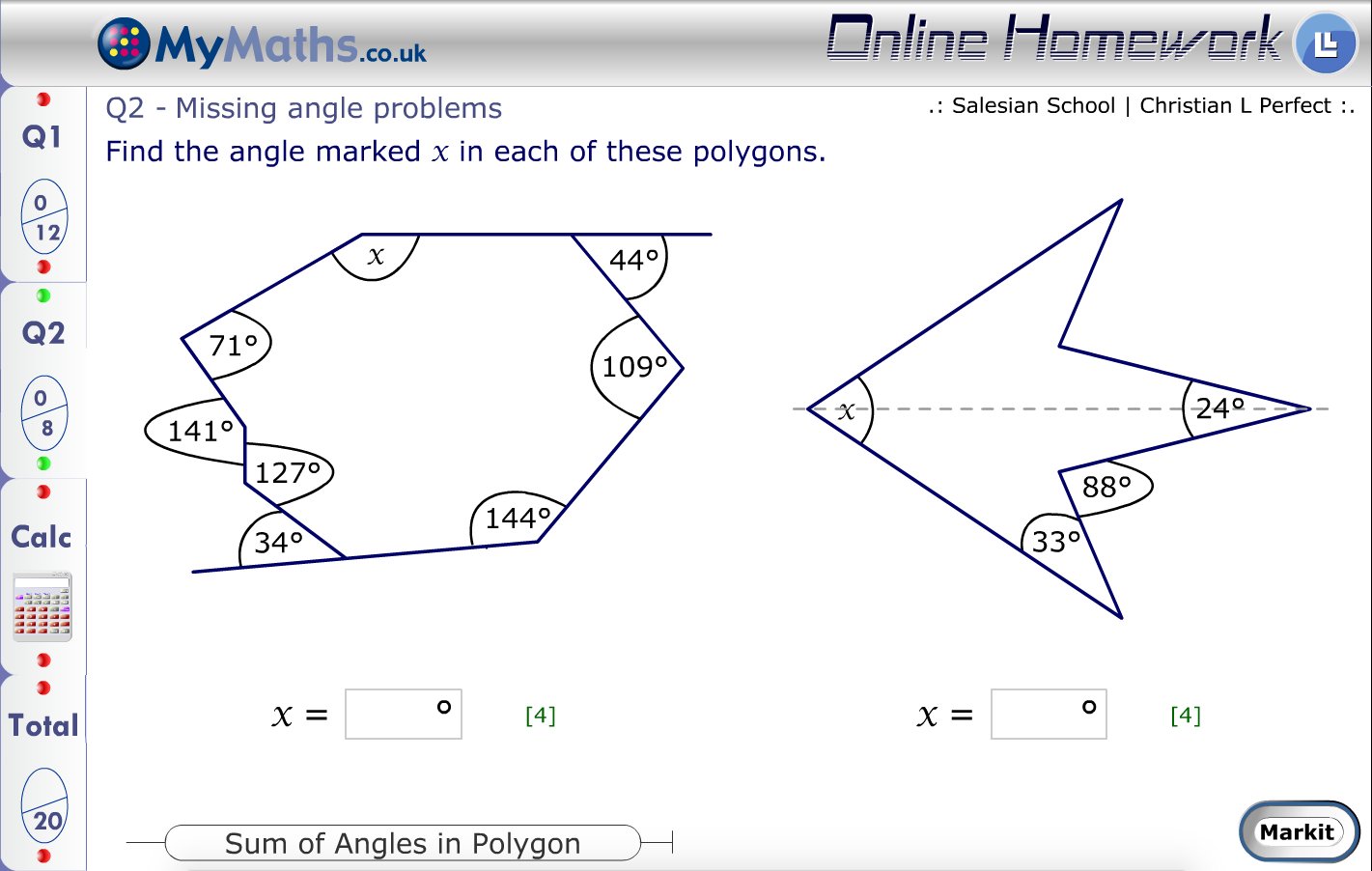
MyMaths

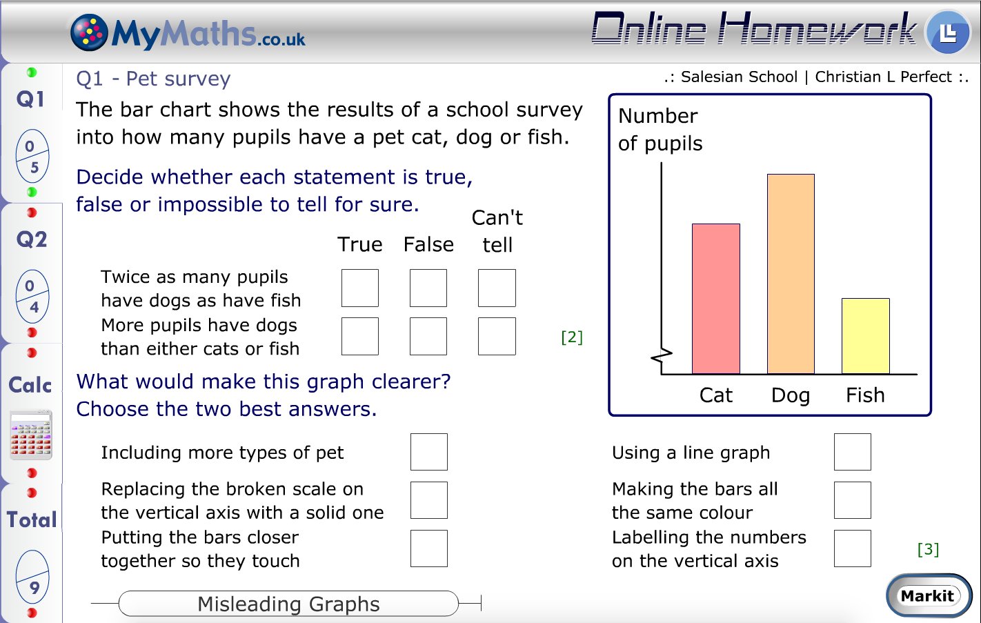
MyMaths

MyMaths
My to-do list
- What UI changes are needed for primary/non-HE use?
- Change the "exam" format to something freer.
- An interface/language for defining custom marking schemes


